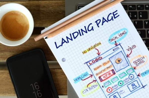

Your organic and paid campaigns are doing great. People are clicking on the link and coming to your landing page.
But here’s a problem: Not a lot of visitors are converting. WHY?
Poor visitor-to-lead conversion is a big challenge for many B2B brands.
Usually, the problem here is the landing page itself. It might have several gaps that you must address to boost conversion.
Here are seven landing page mistakes that are hurting your lead generation:
Yes, content is important. But how you serve that content is equally critical.
So, while you spent so much time crafting the perfect landing page content, did you forget the visual appeal of the page?
The landing page should be visually striking with proper format and a blend of colors that keep the attention glued and drive engagement.
In short, if your landing page doesn’t “look” good, many visitors will leave.
One of the reasons why you should have multiple landing pages for lead generation is that it provides you the opportunity to personalize the content per the audience you’re targeting.
If the content on your landing page isn’t tailored to address the distinct needs and requirements of the visitors, including their pain points and the solutions they are looking for, the conversion will inevitably be less.
This is a mistake especially if you have driven the traffic through paid ads.
People already saw your ad copies/creatives. They are aware of your offerings. Crafting long content on the landing page just to “convince” them is a bad idea. Many of them are already convinced; that’s why they are here.
Audit the size of your landing page content. If it’s too long with unnecessary information, cut it back. (If you are confused about the content length, do A/B testing to find what works better!)
If the landing page has too many links aka ways for visitors to leave the page, that’s not a good sign. Many visitors will take those “ways” and leave without giving you their contact details.
Fix these leaks. Ensure that once someone is on the page, they have no (or very few) options to leave without first signing up.
Just having one CTA button at the end isn’t sufficient.
The call-to-action should be repeated to clarify to the visitors that you want their email address.
From an opt-in form in the first fold to hello-bars and sliders, there are many ways you can show CTA buttons to visitors.
People won’t read everything on the page. Many of the visitors will casually skim through the page and take the action (which is either to leave or give their email addresses).
So, structure the page properly. Incorporate enough whitespace. Ensure the page is easy to skim.
Conversion is a whole different subject altogether. There’s a reason why the leading B2B lead generation agencies like DAT-A-CCURATE™ also home CRO specialists. Because to drive maximum conversion, you need help from experts.
So, in addition to fixing the mentioned mistakes, you also must do a thorough CRO audit of the landing page. The audit will further unearth several gaps, providing you with key insights on how you can improve the page for higher conversion.
In all, if you haven’t implemented CRO measures on the landing page, it will fall short in capturing more leads.
These are some of the common landing page mistakes that are hurting your lead generation ROI.
Fix them and see your results touch newer highs.
If you need help with lead generation, you can always connect with DAT-A-CCURATE™. We have a diverse team of specialists who can leverage organic and paid measures to bolster your lead generation efforts and capture more high-quality leads that are sales-ready.